Stone & Gerken P.A.
Created At
Spry
Client
Stone & Girken
Art Direction
John Oates
Printer
Matt Gallant
Design
Alexander Giraldez


Wow, that's actually kinda deep.
Myself spreaking to Kwok about typeography selection

For This Project
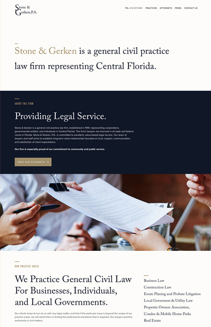
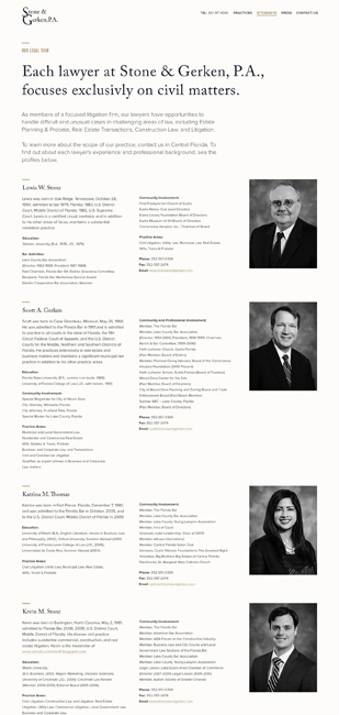
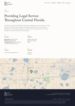
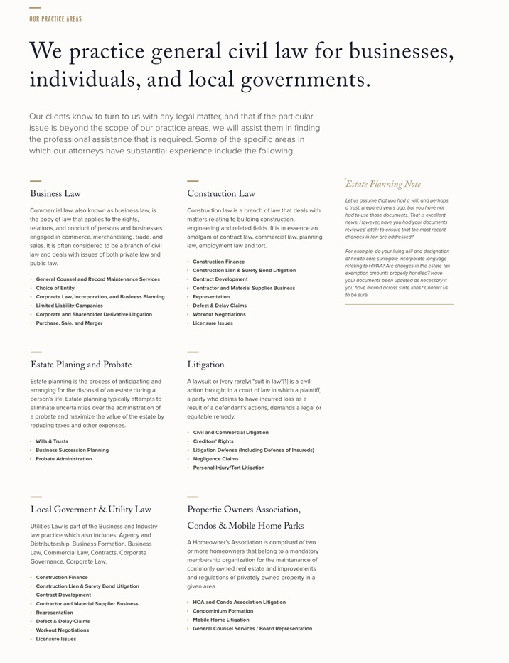
With a quick turnaround and limited assets, the goal was to convey the professional bespoke culture at Stone & Gerkin. The typography plays a big role. Great attention went into pairing the type and building a strong hexarchy to be informative and beautiful. It was fun to adapt a print feel for web.


Responsive layout
All In All
This was a very exciting project stemming from a receptive client. I refined my kerning and leading skills while learning the importance of keeping accurate typerendering in Photoshop. I still use a type test psd that was created for this project to help pair type.